2. Include Your Must-Haves
These days you have to include a number of disclosures or credentials by default to build trust or to protect your company. This includes things like your terms of use, privacy policy, copyright notice, ad or affiliate link disclosure, and much more. If you don’t already have another place to display these, then so be it. Get them out of the way first, so that you can add a little more color to your footer. One of the best ways to incorporate them is to use a multilayer footer, so they have their own segment apart from everything else.
3. Mirror Your Primary Call to Action
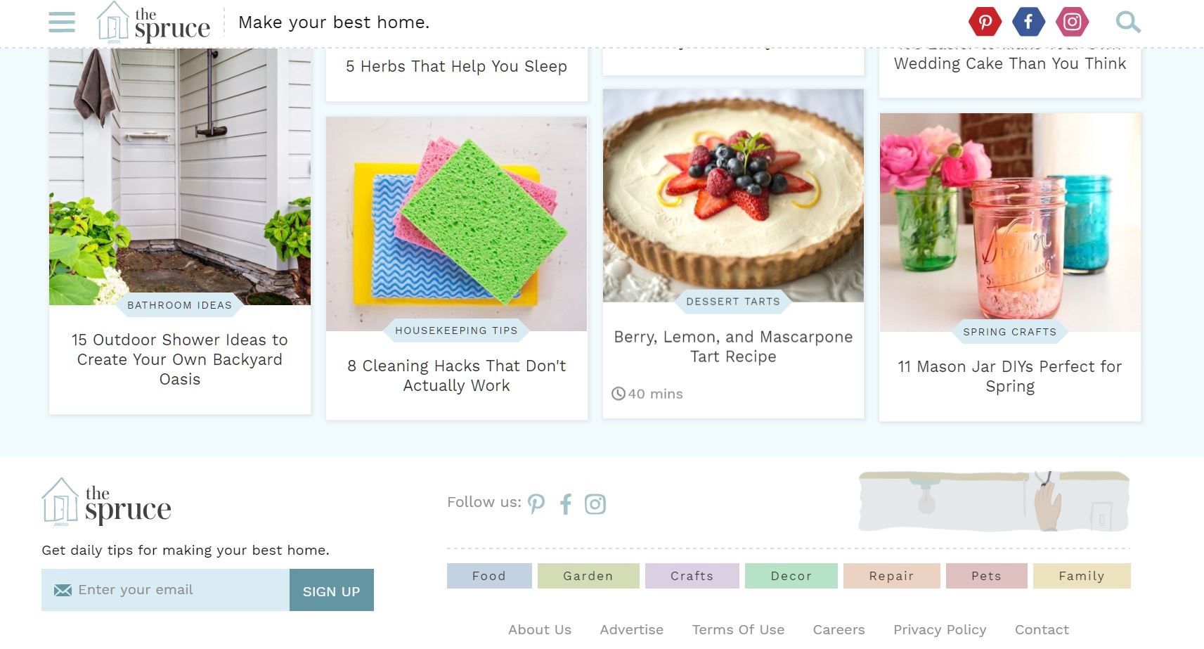
Along with deciding what you want to accomplish with your footer, consider what you’re trying to do with your site. Do you want to sell a product or service, or would you rather boost exposure? Use this information to mirror your call to action. It might entail adding an inline contact form in your footer, adding an email submission or sign-up button, or even encouragement to visit your brick-and-mortar store.
4. Organize Your Items Logically
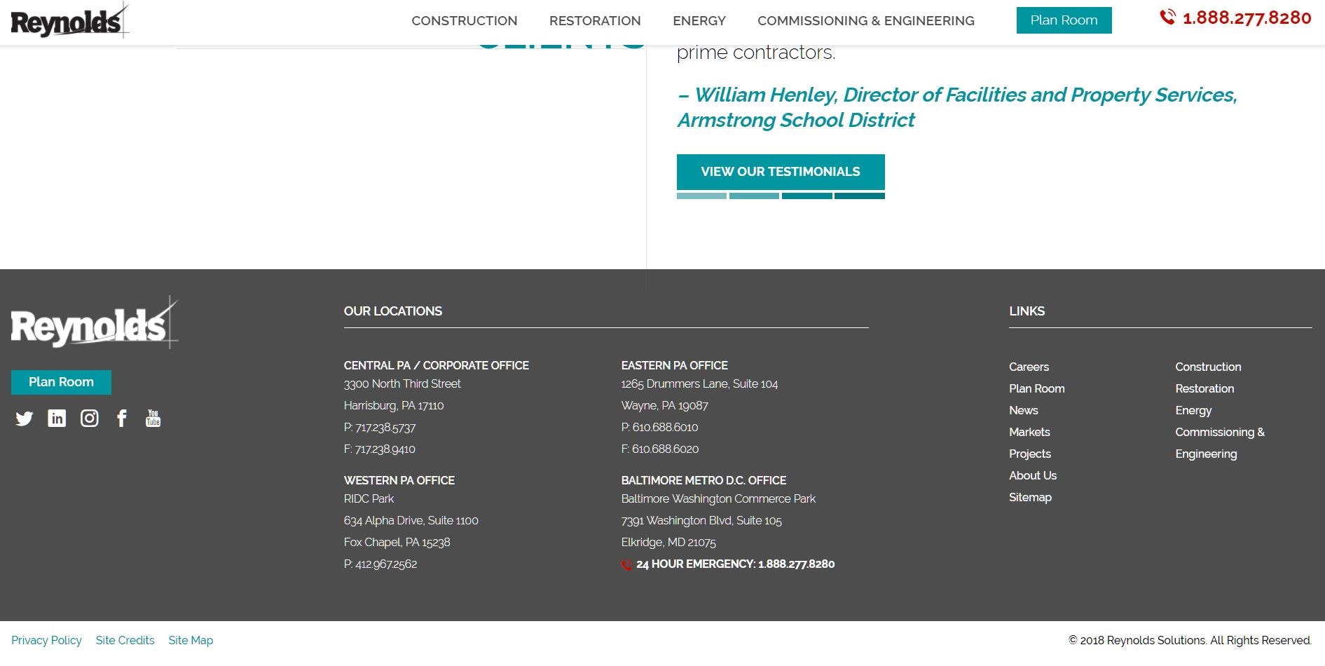
Whether you have a lot of elements in your footer or only a few, the structure is going to influence how effective your content is. If it’s all jumbled and confusing, you might as well have ignored the footer altogether. Organize your footer in a logical way so all the items and elements are paired and segmented appropriately. Most website themes and design tools already include some form of division for the footer area. Each section may be layered, or there may be dividers and segments included already. You see this a lot when a footer is used as another navigation menu. The hyperlinks are generally organized in various sections such as physical locations, services, contact info and more.
5. Get Social
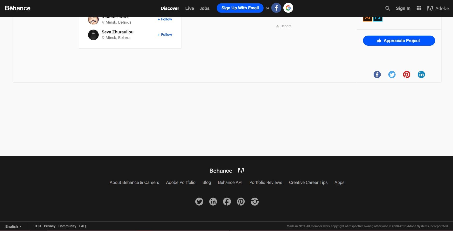
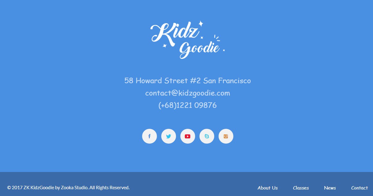
Social media icons — with links to your active social accounts — are the obvious choice here. However, you can also include embed social feeds, recent comments or reviews, press mentions or anything else media-based. The idea is to boost ROI through social engagements. You can also embed social feeds in your footer, so audiences can see what you’ve posted recently or even interact with your social content.
6. Make It Useful
If your footer is just tacked on, with nothing useful or relevant, then it’s certainly not going to contribute anything to your bottom line. Using it for an additional navigation menu is one way to make it useful. You should also include important links and details. Another way to make it useful is to implement a unique content feed. You could deliver tips, advice and even small tutorials in your footer. What this does is draw attention to that area, while providing actionable information for your audience. Eye tracking studies show website readers pay closer attention to images such as infographics. In fact, they spend more time looking at the info-laden images than the text on the page. Use this to your advantage!
7. Shift the View
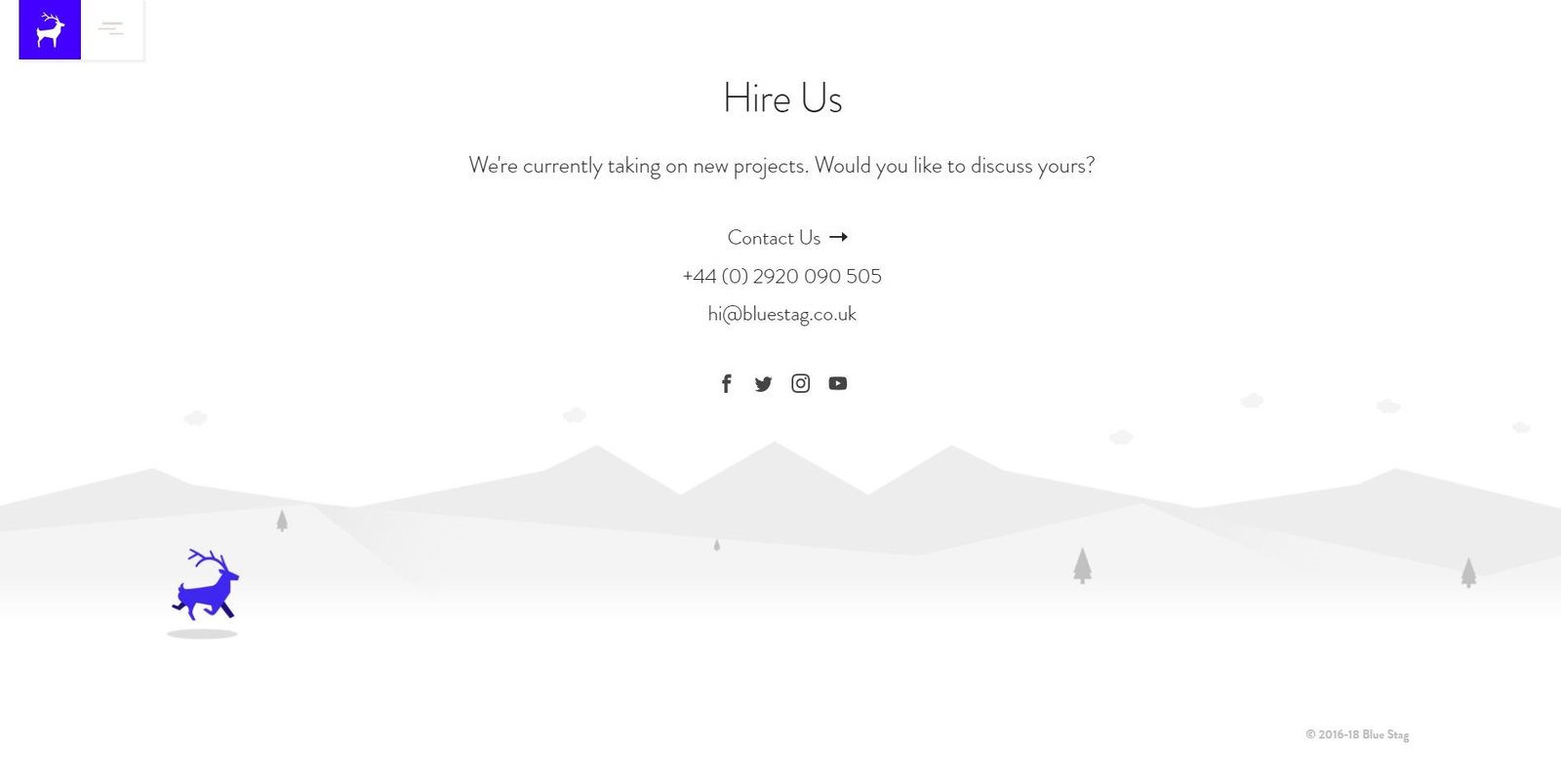
One element commonly found in footers is an option for audiences to return to the top of the page. It makes sense, considering they’ve likely scrolled quite a way down and the navigation option will jump you instantly to the top again. What if you structured your site so the focus shifted back to your call to action? Better yet, what if you used this feature to shift focus to an important section of your page? This highlights the idea that you can use the footer to shift the view of your customer to wherever it is you want them to be.
Keep It Simple
Most of these ideas align with a single concept: adhering to a simple, user-friendly element that doesn’t take away from the rest of the page. You’ll notice that a lot of sites that do it right tend to use minimal design techniques. There’s nothing wrong with being a little flashy, but you definitely don’t want to take away from the rest of your design. The art of using your site’s footer to boost ROI calls for a well-positioned, well-organized footer that enhances the user’s experience. You can do this by adding an additional navigation menu, by including your call to action another time, or even by providing direct links to social networks. Whatever you decide to do, make sure you follow this one basic rule: Keep it simple.


huajin
相当精彩的博客,羡慕哦!