Slider Setup
Contents
1. Content Source
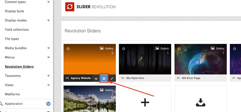
After creating a new slider, select the “Edit Settings” button as shown in the following screenshot to adjust your slider’s main settings.
You’ll then have the option to choose your slider’s content source. “Default Slider” will be selected by default, but as described below, there are several additional options you can choose from.
2. Slider Title
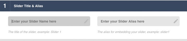
back to topWhere the slider’s Title and Alias are defined.
- Alias Naming:
The slider's "Title" can be anything, but the "Alias" should not have any special characters or spaces
3. Slider Type
back to top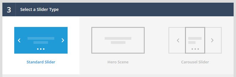
3.1 Standard Slider
The famous, traditional Slider Revolution.
3.2 Hero Scene
Essentially a “one slide” Slider. When selected, multi-slide options such as navigation, autoplay, etc. will be hidden from the slider’s main settings automatically.
3.3 Carousel
When selected, a new Carousel Settings section will become visible where you can setup a wide variety of carousel views.

3.4 Preset Settings
Load a settings preset template for your current slider, or save the slider’s currently selected settings as a preset template to be used for future sliders.

4. Slider Layout
back to top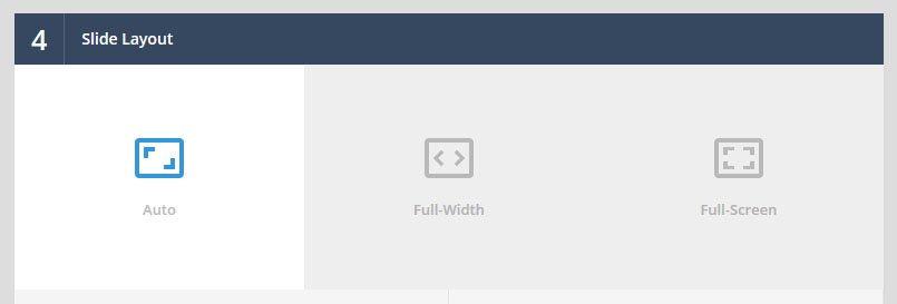
4.1 Auto
The default “responsive” layout. The slider will always inherit the width of its immediate HTML container, allowing it to fit seamlessly inside your theme’s page layout.
4.2 Full-Width
Slider will always stretch across the entire width of the screen.
4.3 Full-Screen
4.4 Layers Grid Size
In order to properly resize content in the slider, the slider needs starting point size values in order to make the responsive calculations.
For example, let’s say you have an “Auto” layout, with a “Layers Grid Width” of “1000px”. But then let’s say the slider is placed inside your web page, which has a content container width of 2000px. In this example, because the theme’s content container width (2000px) is literally 2x the slider’s “Grid Width” (1000px), all of the slider’s content will scale up to 200% its original size.
So let’s say you have a text layer with a 24px font-size. In the above scenario, the text size would scale up to 48px.
But now let’s say the slider were viewed on a mobile device with a screen width of 250px wide. Because 250px is 1/4 the size of the slider’s “Grid Width”, the content would be scaled down to 1/4 its original size, which means a text layer with a 24px font-size would then become 6px.
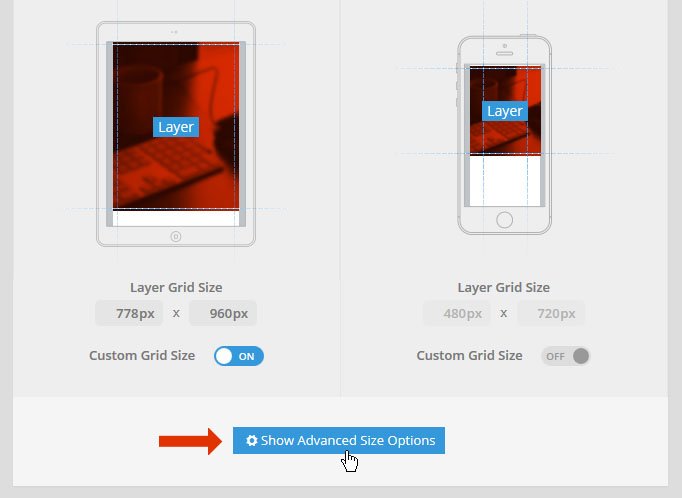
Now in the above scenario, text with a 6px font size is often too small to visibly read, which is why we decided to create “Dynamic Grid Sizes” (shown in screenshot below). Essentially what this does is allow you to style your content for 4 different screen sizes. For example, instead of the default resizing behaviour described in the scenario above, you could specifically set the font size for “Tablet” to be 16px, allowing for a much better text-readability experience.
An easy way to think about this is to compare it to CSS Media Queries, where the “max-width” in a media query would be the “Grid Width” in the screen options below.

In order to enable the ability to design content for multiple screen sizes, you first need to set the “Custom Grid Size” to “On” as shown in the screenshot above.
Then once you’ve activated at least one “Custom Grid Size”, when you edit a slide, you can set different styles (such as varying font-sizes) for each enabled “Custom Grid Size”.

4.5 Advanced Options
For advanced layout options, click the “Show Advanced Size Options” button:
4.5.1 Advanced Options for "Auto" and "Full Width"
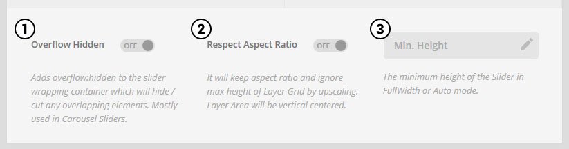
- 1. Overflow Hidden - Useful for Carousel sliders. Otherwise, if you have any content that's placed outside the main slider, leave this "Off".
- 2. Respect Aspect Ratio - The "Layers Grid" height essentially acts as the "max-height" for the slider. But setting the "Respect Aspect Ratio" option to "On" will allow the slider's height to expand beyond this value (effectively disabling a "max-height" for the slider).
- 3. Min. Height - Sometimes a slider can be quite wide with a short height. But then when the slider is resized down, the short height may become too short. In these cases, applying a "min-height" value will ensure that the slider never becomes too short when its resized down.
4.5.2 Advanced Options for "FullScreen"
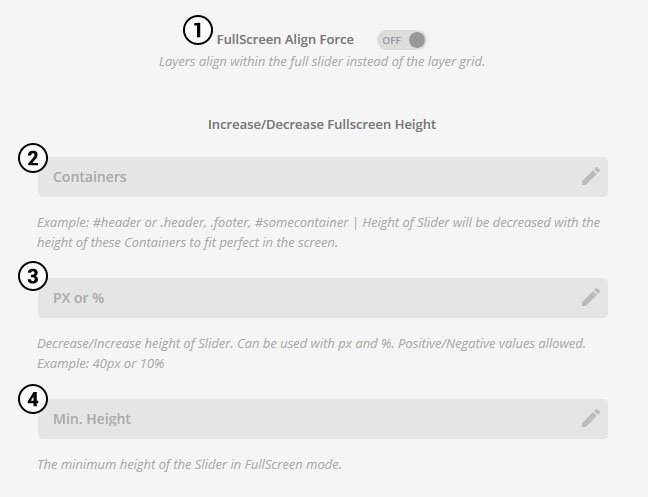
- 1. FullScreen Align Force - Always align content layers based on the actual slider's size (which is variable depending on the screen size) as opposed to the predefined "Layers Grid" sizes.
- 2. Containers - Useful for placing a "FullScreen" slider in between your page's header menu and footer (see note in screenshot for common examples).
- 3. PX or % - Reduce the slider's height by a specific amount of pixels or percentage.
- 4. Min. Height - Apply a minimum height in pixels to your FullScreen slider, ensuring that the slider's height never falls below this number.
