Layer Settings
Contents
1. Layer Settings
back to menu- Predefined Layer Styles
When styling your layer, choose from one of the 100+ styles that’s closest to your desired styling. Then this will act as a “preset” of styles that can be further adjusted with the WYSIWYG editor.
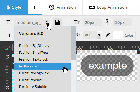
When editing your layers, you’ll start of with a predefined layer style. And additional settings adjustments you make will only be applied to the current layer.
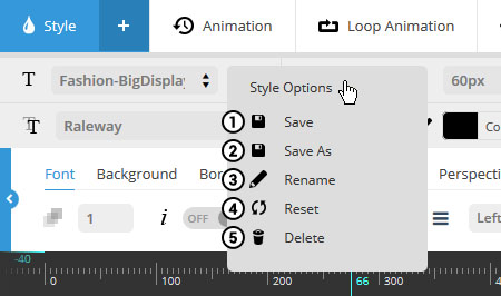
However, once you’ve made adjustments for a specific layer, you can save your adjustments as a new “predefined” layer style to use for additional layers.

1. Save: Override the current preset style with your layer’s current settings (original predefined style will be permanently modified).
2. Save As: Create a new preset style based on the current layer settings (original predefined style will not be overridden).
3. Rename: Change the title of the currently selected preset style for your own convenience.
4. Reset: Revert currently adjusted settings to the predefined layer styles original settings.
5. Delete: Permanently delete the current predefined layer style (can not be undone!).
2. Layer Styles & Positioning
back to menuAfter adding your layer to the slide, use the “Style” section to format text, adjust layer positioning, and also apply additional CSS styles to your layer content.
2.1 Basic Styling
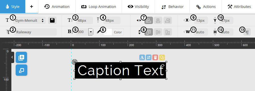
Legend:
- 1. Selected Preset
- 2. Font Family
- 3. Font Size
- 4. Line Height
- 5. Bold Text
- 6. Text Color
- 7. Horizontal Align
- 8. Vertical Align
- 9. Horizontal Offset
- 10. Vertical Offset
- 11. Layer Width
- 12. Layer Height
- 13. Text Wrapping
2. Font Family
Setup your Google Fonts from the slider’s settings section.
7-8. Horizontal / Vertical Aign
Alignment can be based on Layers Grid Size or the entire size of the slider, which is set in the layer’s Behavior section.
* Layer content should always be positioned within the “Layers Grid”. Otherwise the content may bleed off the screen when the slider is resized. Click here for a visual example.
9-10. Horizontal / Vertical Offsets
Offset positions from initial alignments (#7-8). For example, a “Horizontal Alignment” of “center” with a “Horizontal Offset” of 50px would equal 50px to the left of center.
9-10. Layer Width / Height
Entering pixel values will give the layer a predefined size. Or for text layers, enter “auto” for automatic sizing.
13. Text Wrapping
Used in combination with a defined pixel width.. For example, if your layer’s width (#11) is 200px, use the Text-Wrapping option to automatically wrap long lines of text.
2.2 Advanced Styling
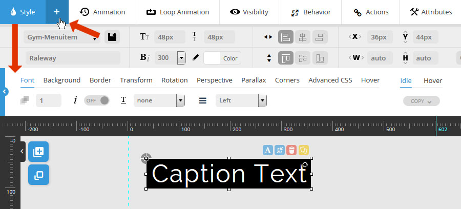
Click the “+” button to activate the advanced styling section.

- 1. Font Opacity
- 2. Italics
- 3. Underline
- 4. Text Align
1. Font Opacity
Enter a number between 0-1, such as “0.75”.
4. Text Align
Text align for the layer itself (unrelated to actual layer positioning).
Useful for layer text with multiple lines (i.e. a paragraph of text).

- 1. Background Color
- 2. Background Opacity
- 3. Padding Top
- 4. Padding Right
- 5. Padding Bottom
- 6. Padding Left
2. Background Opacity
Enter a number between 0-1, such as “0.75”. Or for no background color (i.e. “transparent”), enter the number “0”.
3-6. Padding
When a background color is used, add some “padding” to give your layer text a nice, spaced out background.
Otherwise, for layers with no background color (i.e. “Background Opacity” equals “0”), use the number “0” for the padding values.

- 1. Border Color
- 2. Border Opacity
- 3. Border Style
- 4. Border Size
- 5. Top Border Radius
- 6. Right Border Radius
- 7. Bottom Border Radius
- 8. Left Border Radius
2. Border Opacity
Enter a number between 0-1, such as “0.75”. Or for no background color (i.e. “transparent”), enter the number “0”.
3. Border Style
Choose “solid” for a regular border, and “none” for no border.
5-8. Border Radius
Use to achieve rounded corners for your layers. Applicable for when the layer also has a background color applied (see “Background” tab above).

- 1. Opacity
- 2. scaleX
- 3. scaleY
- 4. skewX
- 5. skewY
1. Opacity
Apply a transparency level to the entire layer. Enter a number between 0-1, such as “0.75”.
1-3. scaleX, scaleY *
Zoom the layer’s width. Click here for an example of “scaleX”, and here for an example of “scaleY”.
* These transforms work best when both have the same values applied (i.e. scaleX = 1.5, scaleY = 1.5).
4-5. skewX, skewY
Applies a 2D angle to the layer. Click here for an example of “skewX”, and here for an example of “skewY”.

- 1. rotationX
- 2. rotationY
- 3. rotationZ
- 4. Horizontal Origin
- 5. Vertical Origin
1-2. rotationX, rotationY
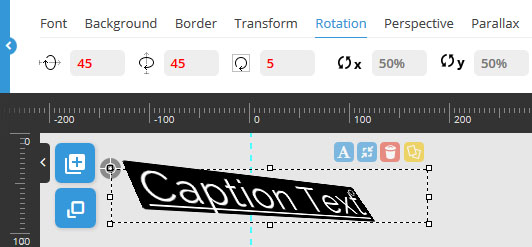
Rotate the layer in 3D space:
3. rotationZ
Can be used in combination with #1 and #2 above, but can also be used by itself for a traditional rotation (i.e. non-3D).
4-5. Horizontal/ Vertical Origin
Usually “50%” is best. Click here for more information.

- 1. 3D Perspective
- 2. translateZ
1. 3D Perspective
Adds depth to an object in 3D space. Click here for additional information.
1. translateZ
The layer’s z-axis position in 3D space. Click here to see an example.

Apply a “Parallax Level” (1-10) to the layer if you’re using the parallax option for the slider.
Click here to learn about the slider’s parallax option works and how it can be used.

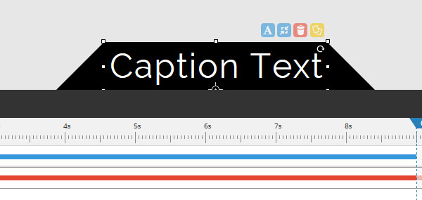
Apply sharp corners to the sides of your layers. The screenshot to the right is a useful example of this, where the layer is positioned at the bottom of the slider.
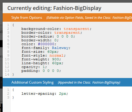
Advanced CSS is in relation to the selected layer style (circled in the screenshot below).

Choose “Template” to modify the CSS for the currently selected predefined layer style.
CSS entered here will be attached to the predefined layer style (i.e. will carry over when used for additional layer content).
Style from Options:
CSS styles automatically applied from the layer’s chosen settings.
Additional Custom Styling:
Add additional CSS that can’t normally be applied through the layer’s WYSIWYG editor.

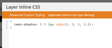
Choose “Layer” to add CSS to this specific layer only.
CSS entered here will not be attached to the predefined style, and therefore will not carry over when the predefined layer style is used for other layers.
The advanced styling section has two possible “states” where styles can be applied.
The first is “idle”, which will be the default styles for the layer, and the second is “hover”, where you can change the layer’s styles for its mouseover state.
To setup some special styles for the layer’s “hover” state, set “Layer Hover” to “ON”, as shown in the following screenshot:

Then once “Layer Hover” is set to “ON”, you’ll see settings for the two states that can be toggled.
Then you’ll have the ability to set specific styles for both the layer’s “Idle” state (default appearance), and its “Hover” state (mouseover appearance).

For convenience, click the “copy” button to copy over styles from one state to the other.
For example, if you’ve applied multiple styles to the “idle” state, but only want to adjust the border-color for the “hover” state, click the “hover” state button, then click the “copy” button, and then choose “copy from “idle”.


Special Hover Settings

- 1. Animation Speed
- 2. Animation Easing
- 3. Hover Mouse Cursor
1-2. Animation Speed / Easing
Idle styles will automatically animate when converted to their hover styles.
“Animation Speed” is in milliseconds, and a number between 200-500 is usually best.
“Easing” is what gives a web animation that “real life” type of movement. Choose between over 35 options to see which one you like best. The most commonly used options are “Power2.easeOut”, and “Power3.easeOut”.
3. Mouse Cursor
The most common choice for a hover mouse cursor is “pointer”, which will be a hand symbol. Other common choices are “auto” and “default”.
3. Layer Animations / Loop Animations
back to menu- Predefined Animation Templates
When setting your layer animations, choose from one of the 30+ animation templates that’s closest to your desired look. Then this will act as a “preset” of settings that can adjusted further.
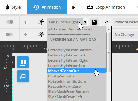
When editing your animations, you’ll start of with a predefined animation template, and additional settings adjustments you make will only be applied to the current layer.
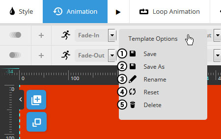
However, once you’ve made adjustments for a specific animation, you can save your adjustments as a new “Animation Template” to use for additional layers.

1. Save: Override the current preset animation with your adjusted current settings (original animation template will be permanently modified).
2. Save As: Create a new Animation Template based on the current settings (original predefined Animation Template will not be overridden).
3. Rename: Change the title of the currently selected Animation Template for your own convenience.
4. Reset: Revert currently adjusted settings to the predefined Animation Template’s original settings.
5. Delete: Permanently delete the current predefined Animation Template (can not be undone!).
3.1 Layer Animations
back to menuAfter adding a layer to the slide, and selecting it in the preview canvas, when you click the “Animation” tab, you’ll see a live preview of the layer’s animation.
Click the “Pause” button to stop the admin preview. And then click the same button to preview your animation once again.

Every content layer has a “Start” animation that will happen when the layer first appears, and an “End” animation for when the layer disappears.
The actual time when these animations take place will depend on the layer’s “Visible Timeline”, which is set in the Layers Timing and Sorting part of the slide’s admin.

Basic Settings

- Special Note:
Select "No Animation" from #1 above if you do not want your layer to animate.
Legend:
- 1. Animation Template
- 2. Animation Easing
- 3. Animation Speed
- 4. Split Animation Text
- 5. Split Animation Delay
1. Animation Template
Choose from over 30+ prebuilt animations. And preview each option by clicking the “Play” button next to the “Animation” tab.
2. Animation Easing
“Easing” is what gives a web animation that “real life” type of movement. Choose between over 35 options to see which one you like best. The most commonly used options are “Power2.easeOut”, and “Power3.easeOut”.
3. Animation Speed
How long the animation will last from start to finish in milliseconds (1000 = 1 second).
An optimal number will depend on your chosen animation. For example, when using a simple “Fade”, a number between 300-500 is usually best, but for more complex animations (especially when using an “easeInOut” easing), a higher number such as 500-1000 will work well.
4. Animate by Words, Letters or Lines
For text-based layers, you can animate words, letters or lines one by one with this option.
Choose “No Split” to just animate the entire layer at once.
5. Split Animation Delay
When animating by words, letters or lines, the essence of the effect is that each will animate one after the other. The delay value here is the amount of time that will be used for this sequenced animation.
The delay value is in milliseconds. A number between 5-30 usually works best.
Advanced Settings
Click the “+” button as shown in the following screenshot to edit the “Start” or “End” animation’s advanced settings.
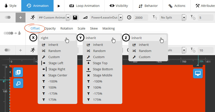
START Animation Settings = Animate FROM these settings
END Animation Settings = Animate TO these settings

X = Horizontal Axis
Y = Vertical Axis
Z = 3D Axis
Choose “Inherit” to honor the animation’s original settings, “Custom” to enter a specific pixel value, or try out one of the other options to see which one you like best.
Adjust the animation’s Opacity (i.e. “transparency”) level.
Choose “Inherit” to honor the animation’s default setting, “Random” to always randomize the value each time the slide is shown, or “Custom” to enter a special value (a number between 0-1).

1. Animate 3D rotationX (rotate around x-axis)
2. Animate 3D rotationY (rotate around y-axis)
3. Animate 2D Rotation (circular, non-3D rotation)
Choose “Inherit” to honor the animation’s default setting, “Random” to always randomize the value each time the slide is shown, or “Custom” to enter a special value (a positive or negative number usually between 0-360).

Choose “Inherit” to honor the animation’s default setting, “Random” to always randomize the value each time the slide is shown, or “Custom” to enter a special value (a number between 0-1).
For a traditional “Zoom” type animation, set the “scaleX” and “scaleY” parameters to the same values.

Choose “Inherit” to honor the animation’s default setting, “Random” to always randomize the value each time the slide is shown, or “Custom” to enter a specific amount of pixels to skew the layer by.

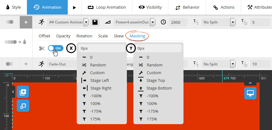
X = Apply a horizontal mask for the animation
Y = Apply a vertical mask for the animation
Apply a mask to the layer, which will result in the animation only becoming visible once the layer is positioned inside the masked area.
For a good understanding of how masking works when applied to animations, click here to see how a generic animation looks with masking applied, and here to see a generic example of the same animation, but without any masking.
3.2 Loop Animations
back to menuApply continuous, animated movement to the layer even after it’s initially animated into view.

1. Loop Animation
Visual Examples: Pendulum | Slide Loop | Pulse | Wave
2. Loop Speed
The amount of time the animation should last before it loops again in seconds. A number between 2-5 usually works best.
3. Loop Easing *
“Easing” is what gives a web animation that “real life” type of movement. For Loop animations, try one of the “easeInOut” options such as “Power1.easeInOut” for a smooth, continuous motion.
* not available for “Wave”, as this animation only works best with a predefined easing.
Loop Parameters

- 1. Starting Rotation
- 2. Ending Rotation
- 3. Rotation X point
- 4. Rotation Y point
1-2. Starting/Ending Rotation
Choose the rotation degrees for the start and end of the looped animation. Use a negative number for the “start” value” and a positive number for the “end” value.
3-4. Rotation X/Y point (transform-origin)
Percentage based values that will act as the axis point for where the layer rotates from.
Loop the layer from one point to another. “X” values are the horizontal plane (left to right), and “Y” values are the vertical plane (top to bottom).

Adjust the Zoom Start (#1) and Zoom End (#2) parameters to continuously zoom the layer in and out. A value of “1” equals 100%, so “1.5” would be 150%, etc.


- 1. Rotation X point
- 2. Rotation Y point
- 3. Start Angle
- 4. Radius of Rotation
1-2. Rotation X/Y point (transform-origin)
Percentage based values that will act as the axis point for where the layer rotates from.
3. Start Angle
Wave animations rotate on a 360 degree circular loop. The “angle” value here would be the starting position for the animation when this loop begins.
4. Radius of Rotation
Defines a pixel-based orbital area that the layer will animate around.
4. Layer Mobile Visibility
back to menuChoose when the layer should be visible such as per device, above a certain screen width, or on mouse hover.
4.1 Visibility on Devices

Show/hide layer on screens higher than 1024px width (regular desktop view).
Show/hide layer on screens 1024px wide or higher (tablet landscape).
Show/hide layer on screens 768px wide or higher (tablet portrait / smartphone landscape).
Show/hide layer on screens 360px wide or higher (smartphone portrait).
4.2 Hide Under Width / Only on Slide Hover

1. Hide "Under" Width
Layer will be hidden according to slider’s Hide Element Under Width -> Predefined Layers value in the slider’s main settings.
2. Only on Slide Hover
Layer will only be shown when the user hovers their mouse over the screen (for mobile devices, the hover equivalent would be a finger “tap”).
5. Responsive Behavior
back to menu
1. Auto Responsive
Choose to make the layer responsive by default (layer will resize when slider resizes).
2. Child Elements Responsive
If the layer contains additional content (raw HTML, shortcode from other plugin, etc.), the slider will attempt to resize all nested elements.
3. Align
Layer Alignment is particularly useful for when using Full Width slider, as sometimes you want your content to align to the sides of the screen as opposed to your slider’s “Layers Grid” size.
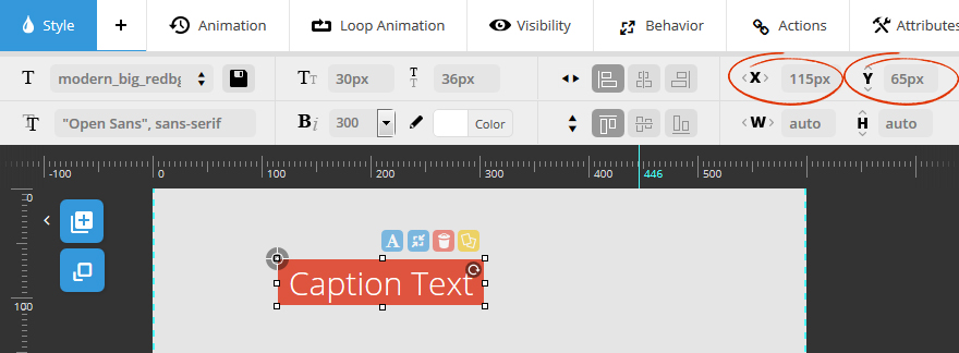
In the following example, the layer has a “top left” alignment, with an “Offset X” of 115px and an “Offset Y” of 65px.
The example slider below has a “Full Width” Slider Layout and a “Layers Grid” of 600×400. When the screenshots were taken, the screen size was 900px wide, so the slider had also “responded” to this width.
Layer Align Behavior: Grid Based
Layer will always be aligned and positioned based on the slider's grid size (i.e. 115px from the left of the Layer's Grid boundaries).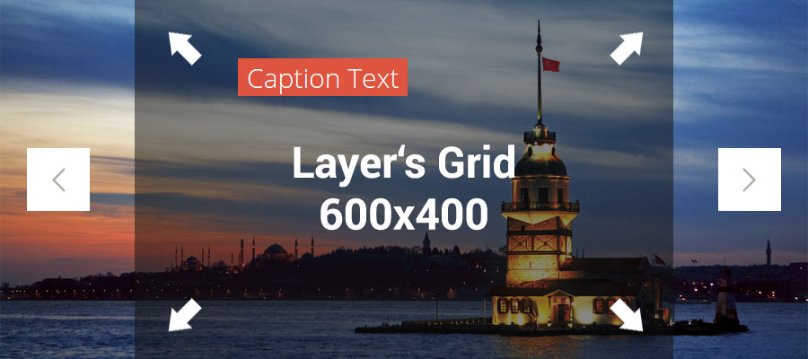
Layer Align Behavior: Slide Based
Alignment and positioning of Layers will always be based on the slider's actual size (i.e. 115px to the left of the screen).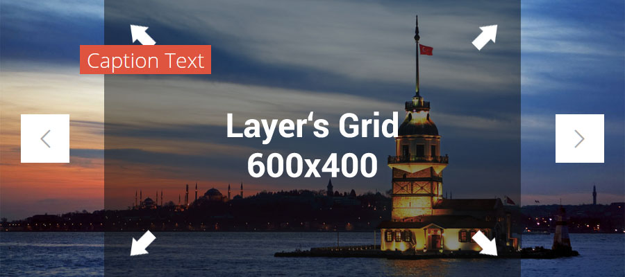
4. Responsive Offset
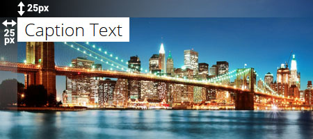
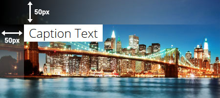
In the following example, the layer has a “top left” alignment, with a 50px offset from the top and left.
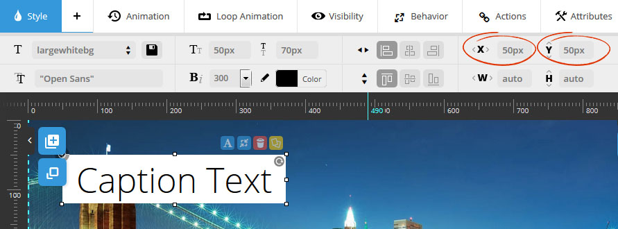
Responsive Offset: ON
When the slider is resized down by 50%, the Layer’s original “Offset” values are also reduced by 50%.
Responsive Offset: OFF
When the slider is resized down by 50%, the Layer’s original “Offset” values are NOT reduced or changed.
6. Actions / Hyperlinks
back to menuSlider Revolution 5.0 introduced a new way of hyperlinking Layers, called “Actions”.
An “Action” is essentially something that happens when the user interacts with the Layer’s content (clicking the layer, or mouse hovers).
To add a Layer Action, select the Layer on the preview stage canvas, and then from the "Actions" tab, click the "+" button.

Next, choose what type of mouse interaction should be applied to the Layer (click, "Mouse Enter" (mouse-over/hover), or "Mouse Leave" (i.e. mouse-out)

Next, click one of the links from the submenu below to learn about the many different Layer Action possibilities.
6.1 Link Layer to another web page
back to menu
1. Actions Menu
Choose “Simple Link”
3. Link Target
Choose “Same Window” to open the link in the same window/tab.
Choose “New Window” to open the link in a new window/tab.
2. Link Url
Enter the full url (including the “http://” part) of the web page you wish to hyperlink to.
4. Link Type
Choose “A Tag Link” for best SEO practices. Or choose “jQuery link” if you’d rather the link be opened with JavaScript instead.
6.2 Navigate to a different slide
back to menuUseful for building custom navigation, such as a special slider menu, etc.
Navigate to a specific Slide

Navigate to Previous Slide

Navigate to Next Slide

6.3 Play/Pause Slider
back to menuUseful for building a special “play/pause” button to control the slider’s autoplay.
Play Slider

Pause Slider
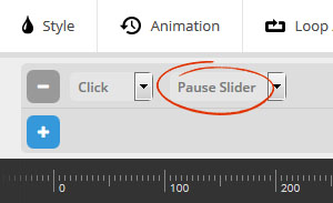
Toggle Play/Pause

6.4 Scroll below slider
back to menuUseful for applying to a “Read More” button, which would then scroll to additional content below the slider.
Use the “Scroll Offset” option to scroll additional pixels below the slider.

6.5 Show/Hide Additional Layers
back to menuAdd interactivity to your slides by controlling Layer visibility with these options (i.e. clicking one Layer shows another Layer).
To get started, choose a "Target" Layer that you'd like to control (#2 below).

Next, choose one of the following options from the Layer Actions menu (#1 above).
1. Start Layer "in" Animation"
back to menu“Target” Layer will be initially hidden, and then animated into view when current Layer’s Action is triggered (on-click or hover).

1. Target Layer
Other Layer that will be animated into view.
3. Animation Timing
Choose “Wait for Trigger” to honor the Layer Action’s default behaviour.
Or use one of the additional options to “replay” animations upon user-interaction.
2. Delay
Add a small delay (in milliseconds) before the Target Layer is animated into view.
4. Trigger Memory
Choose “Keep Last Selected State” to remember the user’s previous interaction.
Choose “Reset Animation and Trigger States every Loop” to not remember the user’s previous interaction.
2. Start Layer "out" Animation
back to menu“Target” Layer will animate out of view when current Layer’s Action is triggered (on-click or hover).

1. Target Layer
Other Layer that will be animated out of view.
3. Animation Timing
Choose “Wait for Trigger” to honor the Layer Action’s default behaviour.
Or use one of the additional options to “replay” animations upon user-interaction.
2. Delay
Add a small delay (in milliseconds) before the Target Layer is animated out of view.
4. Trigger Memory
Choose “Keep Last Selected State” to remember the user’s previous interaction.
Choose “Reset Animation and Trigger States every Loop” to not remember the user’s previous interaction.
3. Toggle Layer Animation
back to menu“Target” Layer will alternately animate into and out of view as current Layer’s Action is triggered (on-click or hover).

1. Target Layer
Other Layer that will be animated out of view.
3. At Start
The Target Layer’s initial visibility, where “Play in Animation” equals “initially visible” and “Keep Hidden” equals “initially hidden”.
5. Trigger Memory
Choose “Keep Last Selected State” to remember the user’s previous interaction.
Choose “Reset Animation and Trigger States every Loop” to not remember the user’s previous interaction.
2. Delay
Add a small delay (in milliseconds) before the Target Layer is animated out of view.
4. Animation Timing
Choose “Wait for Trigger” to honor the Layer Action’s default behaviour.
Or use one of the additional options to “replay” animations upon user-interaction.
6.6 Play/Pause Video
back to menuUseful for building a special “play/pause” button for a Video.

1. Video Action
Choose to Start, Stop, or Toggle the play/pause state of the Target Layer’s Video.
2. Target Layer
Layer that contains the Video (can be current Layer or a different Layer).
3. Delay
Add a small delay (in milliseconds) before the Action takes place.
6.7 Advanced Actions: Simulate Click / Toggle Layer Class
back to menuSimulate Click:
Useful if other Layer has jQuery event attached that needs to be triggered.
1. Target Layer
Other Layer to simulate the click action.
2. Delay
Add a small delay (in milliseconds) before the Target Layer is animated out of view.
Toggle Layer Class:
Add/Remove CSS Class for a Layer.For example, you could add a special Class to the Layer for your custom CSS, and then toggle this class on and off with this Layer Action.

1. Target Layer
Layer where Class will be added/removed (can be current Layer or a different Layer).
2. Delay
Add a small delay (in milliseconds) before the Target Layer is animated out of view.
3. Class
Name of the CSS Class to toggle on and off.
7. Attributes / Performance
back to menuLayer attributes can help with adding advanced Custom CSS for a specific Layer. Example usage:
1 2 3 | .tp-caption.custom-class {text-shadow: 0 0 1px rgba(0, 0, 0, 0.5)} |

1-4. ID, Class, Title, Rel: Add a custom attribute to the Layer for advanced usage.
5: Image Alt Text: Add “Alt” text for Layer Images for maximum SEO.
From Media Library: Alt text will be taken from “WP Main Menu -> Media -> Library -> Select Image -> Alt Text”.
From Filename: Image’s filename will be used for the Alt text.
Custom: Enter a custom value (field #6 above) for the Alt text.
8. Image Layer Performance
back to menuChoose which version of the image should be loaded and also if the image should be Lazy-Loaded.

1. Lazy Loading:
Default Settings – Image will be loaded according to the slider’s global Lazy Load setting.
Force Lazy Loading – Lazy Load the image regardless of global Lazy Load setting.
Ignore Lazy Loading – Do not Lazy Load the image regardless of global Lazy Load setting.
2. Source Type:
Choose which version of the image should be loaded. Often “Original” can equal a very large file size, so usually “Large” or “Medium” is a good choice for optimal loading performance.
Choose “Default Setting” to use the slider’s global Image Source Size setting. Or override the default setting with one of the other choices.
9. Layers Timing and Sorting
back to menuThe Layers Timing & Sorting section is a visual representation of the slide’s animation sequence. It’s also where you can adjust the z-index depth for each Layer (i.e. Text Layer should appear on top of Image Layer, etc.).

1. Play/preview the current slide’s animation sequence (slider’s main background and layers).
2. Reset the timeline so it can be previewed from the start.
3. Drag with your mouse for a slow motion / manual preview experience.
4. Increase/decrease the slide’s main delay.

1. Represents the Slide’s Main Background that initially animates in when the slide is shown.
2. Example Text Layer
3. Example Image Layer

Drag the Layer’s timeline left and right to position the layer’s “visibility” within the lifetime of the current slide.
In the above example, the “Image Layer” is set to animate in at the “1.5 second” mark, and then will animate out at the “5.5” second mark.

1. Represents the Layer’s “Start” animation.
2. The Layer will be in a “Static” state during this time (has already animated into view, and has not animated out of view yet).
3. Represents the Layer’s “End” animation.
In the above screenshot, the “Start” animation is set to last for 1 second, and the “End animation will last for 0.5 seconds. Drag the mini-circles left and right to increase or reduce these times.

Represents a custom "End" time for the layer (layer will disappear before the slide's official end has been reached).
Click to set the Layer's "End" animation time to equal the very end of the slide's timeline.

Drag the listed Layers with your mouse on top of one another to sort the Layers, setting their z-index/stacking order. Layers that are hyperlinked should always have a higher z-index than other layers (i.e. positioned below other Layers in the list).
And lastly, drag the horizontal scrollbar at the bottom in case your Layer has a large “delay” value (i.e. a longer timeline).

