FAQ's
Simple
- Add a Slider to a Web Page
- Disable Autoplay
- Hyperlinking Slides and Layers
- Ideal Image Size
- Understanding "Unlimited Height"
- Reuse Purchase Code on New Site
- Custom Image Hovers
- What is a "Slider Template"?
Advanced
- API Example
- Add Slider via PHP
- Show a random slider on any given page
- Increase Size of Text on Mobile
- Alternative Mobile Slider
- Pause/Resume the slider on page scroll
- Pause/Resume Slider on Scroll with jQuery WayPoints
- Fade out Parallax Layers on Scroll
- 9x Slider – Synchronous Grid Slider
- Slide Change based on MouseWheel
- Include in Theme for Sale
Installation - View Screencast
If you're reading this, it means you've successfully unzipped the download zip from CodeCanyon. At the root folder of this zip, you'll find several other folders and files. The zip that can be installed will be located here, and is named revslider.zip. Once you've located this zip file, you're ready to upload it to your Drupal module page and install the module.
Dependencies modules and libraries
Slider Revolution is requires Media, Field Group, Behavior Weights, jQuery Update and jQuery 1.7 or hight version. Please make sure you have all requires modules enabled.
Install via Module manager
On admin toolbar, you choose Modules => Install new module then select revslider.zip file then click Install and and wait while plugin is uploaded to your server.
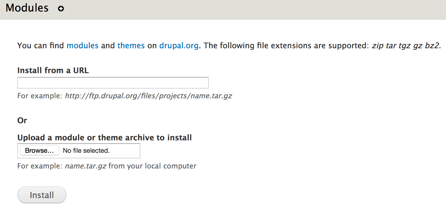
After successfully message, click "Enable newly added modules". Find "Slider Revolution" in module lists and enable it.
Install via FTP
Unzip revslider.zip file, and upload it to modules folder of sites (sites/all/modules). Then go to modules list page find "Slider Revolution" and enable it.
Importing Demo Sliders - View Screencast
Sometimes the easiest way to learn is to start with an example that's already built and then modify it. To do that, we can import one of the demo examples available. Here's a list of the available demos. Click the listed links to see the online demos they correspond to (actual imported content may vary).
- fullfeature_boxed.zip - view demo
- fullfeature_fullscreen.zip - view demo
- fullfeature_fullwidth.zip - view demo
- kenburns_boxed.zip - view demo
- kenburns_fullscreen.zip - view demo
- kenburns_fullwidth.zip - view demo
- kenburnsexport.zip - view demo
- parallax_scroll_slider.zip - view demo
- parallax_slider.zip - view demo
- sliderpreview.zip - view demo
- sliderpreview_fullscreen.zip - view demo
- textsplits.zip
- vertical_boxed.zip - view demo
- vertical_fullscreen.zip - view demo
- vertical_fullwidth.zip - view demo
- video_boxed.zip - view demo
- video_fullscreen.zip - view demo
- video_fullwidth.zip - view demo
- videoexport.zip - view demo
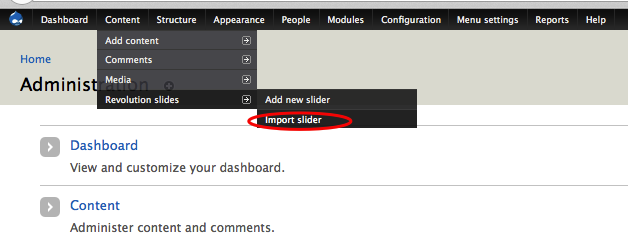
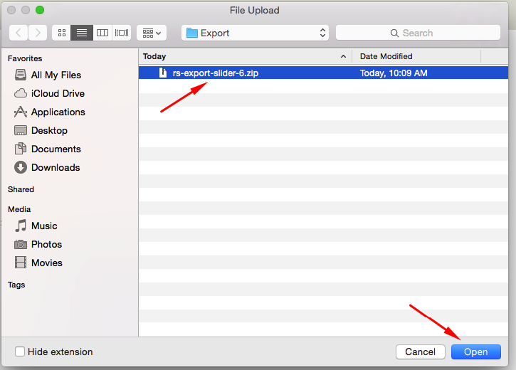
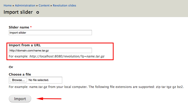
To get started, from the admin toolbar, click the Content >> Revolution slides >> Import slider
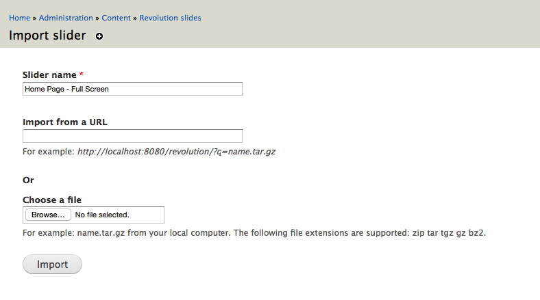
Next, navigate to the import file or online url:
Or
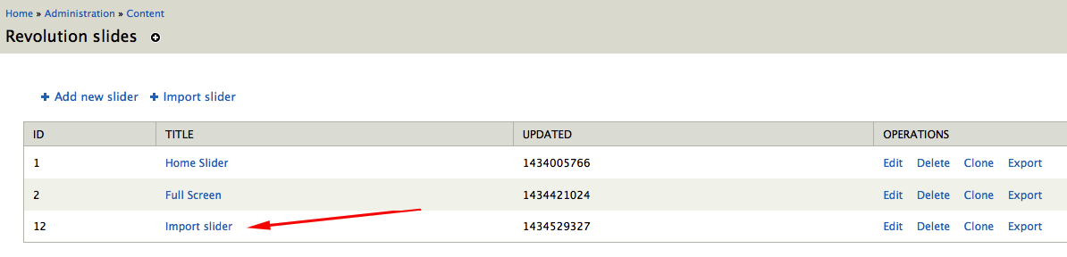
After importing the example, you'll then see the slider listed at the bottom of the page:
Creating a New Slider - View Screencast
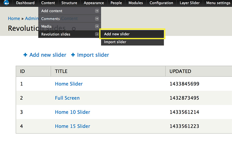
To create a new slider, on admin toolbar choose Content => Revolution sliders => Add new slider:
Next, give the slider a name
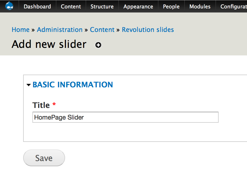
Finally, click the Save button.
You're now ready to start adding slide/layer.
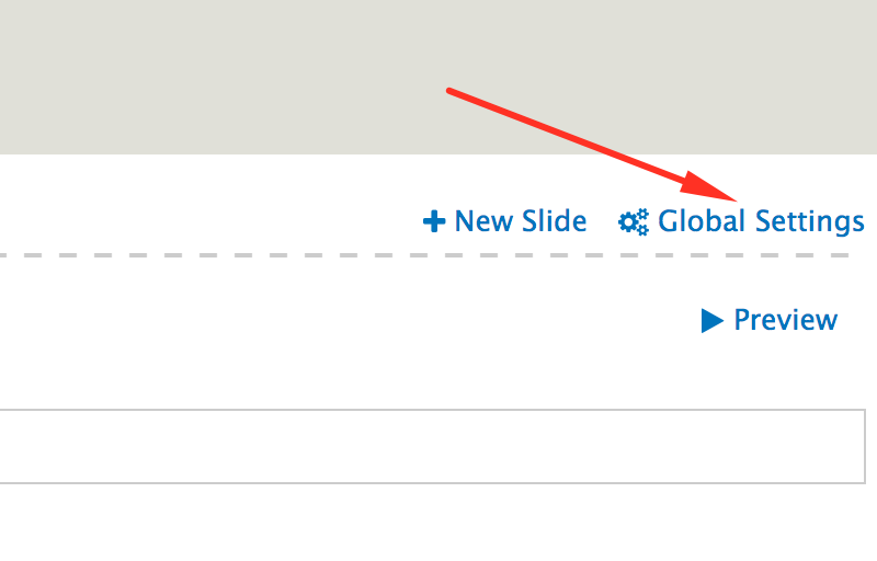
Global Settings
Once you've created your first slider, the next step is to choose your slider's main settings. From your slider edit page, click the "Global Settings" link at top right of page
- General Settings
- Navigation
- Loops
- Thumbnail
- Mobile Visibility
- Layout & Styles
- Parallax Settings
- Pan Zoom Settings
- Further Options
General Settings
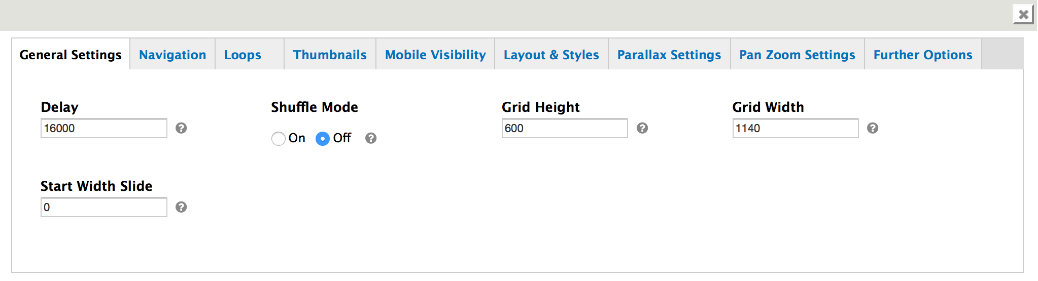
- Delay: The time one slide stays on the screen in Milliseconds. Global Setting. You can set per Slide extra local delay time via the data-delay in the element (Default: 9000)
- Shuffle Mode: Turn Shuffle Mode on and off! Will be randomized only once at the start.
- Grid Width: This width of the Grid where the Captions are displayed in Pixel. This Width is the Max Width of Slider in Responsive Layout. In Fullscreen and in FullWidth Layout the Gird will be centered Horizontally in case the Slider is wider then this value.
- Grid Height: This Height of the Grid where the Captions are displayed in Pixel. This Height is the Max Height of Slider in Responsive Layout. In Fullscreen and in FullWidth Layout the Gird will be centered Horizontally in case the Slider is wider then this value.
- Start Width Slide: Start with a Predefined Slide (index of the slide).
Navigation
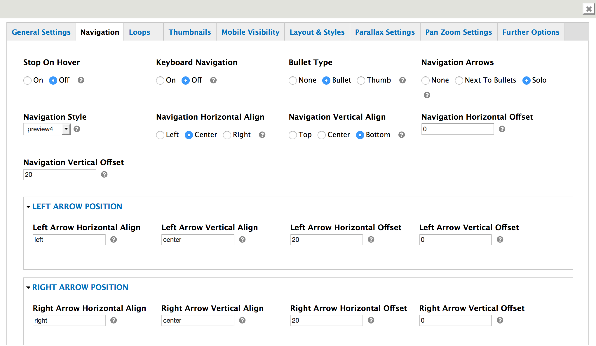
- Stop On Hover: Stop the Timer if mouse is hovering the Slider. Caption animations are not stopped !! They will just play to the end.
- Keyboard Navigation: Allows to use the Left/Right Arrow for Keyboard navigation when Slider is in Focus.
- Bullet Type:Display type of the 'bullet/thumbnail' bar (Default:'none').
- Navigation Arrows:Display position of the Navigation Arrows (Default: 'nexttobullets'). Possible values are 'nexttobullets', 'solo'. Nexttobullets - arrows added next to the bullets left and right, solo - arrows can be independent positioned, see further options.
- Navigation Horizontal Align: Vertical and Horizontal Align of the Navigation bullets / thumbs (depending on which Style has been selected). Possible values navigationHAlign: 'left','center','right'.
- Navigation Vertical Align: Vertical and Horizontal Align of the Navigation bullets / thumbs (depending on which Style has been selected). Possible values naigationVAlign: 'top','center','bottom'.
- Navigation Horizontal Offset: The Offset position of the navigation depending on the aligned position. from -1000 to +1000 any value in px. i.e. -30.
- Navigation Vertical Offset: The Offset position of the navigation depending on the aligned position. from -1000 to +1000 any value in px. i.e. -30.
- Left Arrow Horizontal Align: Vertical and Horizontal Align of the Navigation Arrows (left and right independent!) Possible values navigationHAlign: 'left','center','right' and naigationVAlign: 'top','center','bottom'.
- Left Arrow Vertical Align: Vertical and Horizontal Align of the Navigation Arrows (left and right independent!) Possible values navigationHAlign: 'left','center','right' and naigationVAlign: 'top','center','bottom'.
- Left Arrow Horizontal Offset: The Offset position of the navigation depending on the aligned position. from -1000 to +1000 any value in px. i.e. -30 Each Arrow independent.
- Left Arrow Vertical Offset: The Offset position of the navigation depending on the aligned position. from -1000 to +1000 any value in px. i.e. -30 Each Arrow independent.
- Right Arrow Horizontal Align: Vertical and Horizontal Align of the Navigation Arrows (left and right independent!) Possible values navigationHAlign: 'left','center','right' and naigationVAlign: 'top','center','bottom' .
- Right Arrow Vertical Align: Vertical and Horizontal Align of the Navigation Arrows (left and right independent!) Possible values navigationHAlign: 'left','center','right' and naigationVAlign: 'top','center','bottom' .
- Right Arrow Horizontal Offset: The Offset position of the navigation depending on the aligned position. from -1000 to +1000 any value in px. i.e. -30 Each Arrow independent.
- Right Arrow Vertical Offset: The Offset position of the navigation depending on the aligned position. from -1000 to +1000 any value in px. i.e. -30 Each Arrow independent.
- touchenabled: Enable Swipe Function on touch devices.
- Navigation Style: Look of the navigation bullets if navigationType 'bullet' selected.
- Navigation Style: Look of the navigation bullets if navigationType 'bullet' selected.
Loops
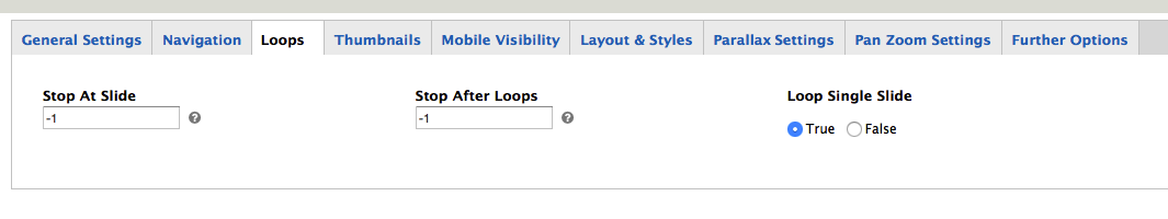
- Stop At Slide: Stop Timer if Slide 'x' has been Reached. If stopAfterLoops set to 0, then it stops already in the first Loop at slide X which defined. -1 means do not stop at any slide. stopAfterLoops has no sinn in this case.
- Stop After Loops: Stop Timer if All slides has been played 'x' times. IT will stop at THe slide which is defined via stopAtSlide:x, if set to -1 slide never stop automatic
Thumbnail
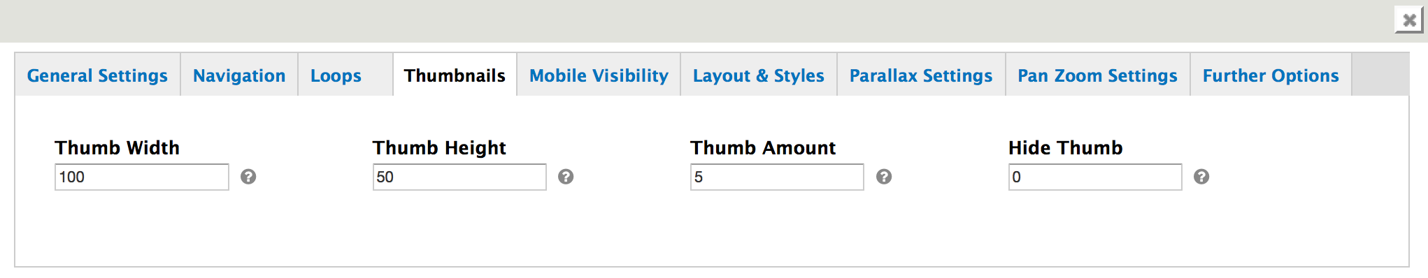
- Thumb Width: The width and height of the thumbs in pixel. Thumbs are not responsive from basic. For Responsive Thumbs you will need to create media qury based thumb sizes.
- Thumb Height: The width and height of the thumbs in pixel. Thumbs are not responsive from basic. For Responsive Thumbs you will need to create media qury based thumb sizes.
- Thumb Amount: The Amount of visible Thumbs in the same time. The rest of the thumbs are only visible on hover, or at slide change.
- Hide Thumb: 0 - Never hide Thumbs. 1000- 100000 (ms) hide thumbs and navigation arrows, bullets after the predefined ms (1000ms == 1 sec, 1500 == 1,5 sec etc..)
Mobile Visibility
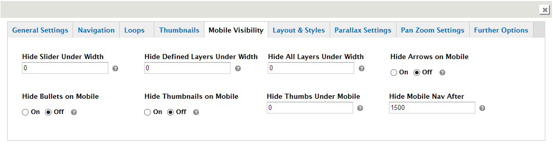
- Hide Slider Under Width: Hide the whole slider, and stop also functions if Width of Browser is less than this value
- Hide Defined Layers Under Width: It Defines if a caption should be shown under a Screen Resolution ( Basod on The Width of Browser)
- Hide All Layers Under Width: Hide all The Captions if Width of Browser is less then this value
- Hide Arrows on Mobile: If set to 'on', Arrows are not shown on Mobile Devices.
- Hide Bullets on Mobile: If set to 'on', Bullets are not shown on Mobile Devices.
- Hide Thumbnails on Mobile: If set to 'on', Thumbs are not shown on Mobile Devices.
- Hide Thumbs Under Mobile: Possible Values: 0 - 1900 - defines under which resolution the Thumbs should be hidden. (only if hideThumbonMobile set to off.
- Hide Mobile Nav After: Hide all navigation after a while on Mobile (touch and release events based).
Layout & Styles
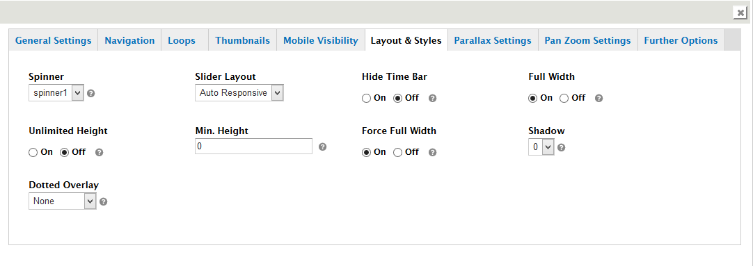
- Spinner: The Layout of Loader. If not defined, it will use the basic spinner.
- Slider Layout
- Hide Time Bar: It will hide or show the banner timer
- Full Width: Defines if the fullwidth/autoresponsive mode is activated.
- Unlimited Height: Defines if in fullwidth mode the height of the Slider proportional always can grow. If it is set to 'off' the max height is == startheight.
- Min. Height: Possible Values: 0 - 9999 - defines the min height of the Slider. The Slider container height will never be smaller than this value. The Content container is still shrinks linear to the browser width and original width of COntainer, and will be centered vertically in the Slider.
- Force Full Width: Force the FullWidth Size even if the slider embeded in a boxed container. It can provide higher Performance usage on CPU. Try first set it to 'off' and use fullwidth container instead of using this option..
- Shadow: Possible values: 0,1,2,3 (0 == no Shadow, 1,2,3 - Different Shadow Types).
- Dotted Overlay: Creates a Dotted Overlay for the Background images extra. Best use for FullScreen / fullwidth sliders, where images are too pixaleted..
Parallax Settings
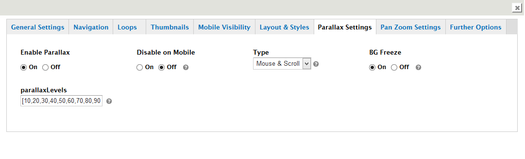
- Enable Parallax
- Disable on Mobile: Turn on/ off Parallax Effect on Mobile Devices
- Type: How the Parallax should act. On Mouse Hover movements and Tilts on Mobile Devices, or on Scroll (scroll is disabled on Mobiles !)
- BG Freeze: If it is off, the Main slide images will also move with Parallax Level 1 on Scroll..
- parallaxLevels: An array which defines the Parallax depths (0 - 10). Depending on the value it will define the Strength of the Parallax offsets on mousemove or scroll. In Layers you can use the class like rs-parallaxlevel-1 for the different levels. If one tp-caption layer has rs-parallaxlevel-X (x 1-10) then it activates the Parallax movements on that layer. - Creates a Dotted Overlay for the Background images extra. Best use for FullScreen / fullwidth sliders, where images are too pixaleted..
Pan Zoom Settings
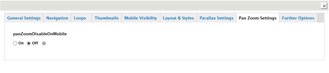
- panZoomDisableOnMobile: Turn on/ off Pan Zoom Effects on Mobile Devices
Further Options
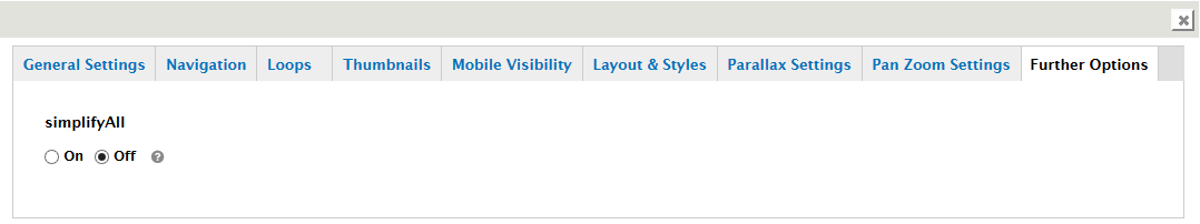
- simplifyAll: Set all Animation on older Browsers like IE8 and iOS4 Safari to Fade, without splitting letters to save performance
Slider Main Image / Background

- Background
- Lazy Loading: Here you need to declare the Path and File name of the image you wish to load as Main Image in Slide.
- Ken Burns Effect: on/off to turn on Ken Burns Effect or keep it disabled.
- Background Repeat: The way the image is shown in the slide main container.
- Background Fit: Select one to decide how the image should fit in the Slide Main Container. For Ken Burn use only a Number, which is the % Zoom at start. 100 will fit with Width or height automatically, 200 will be double sized etc...
- Background Position
General Slide Settings
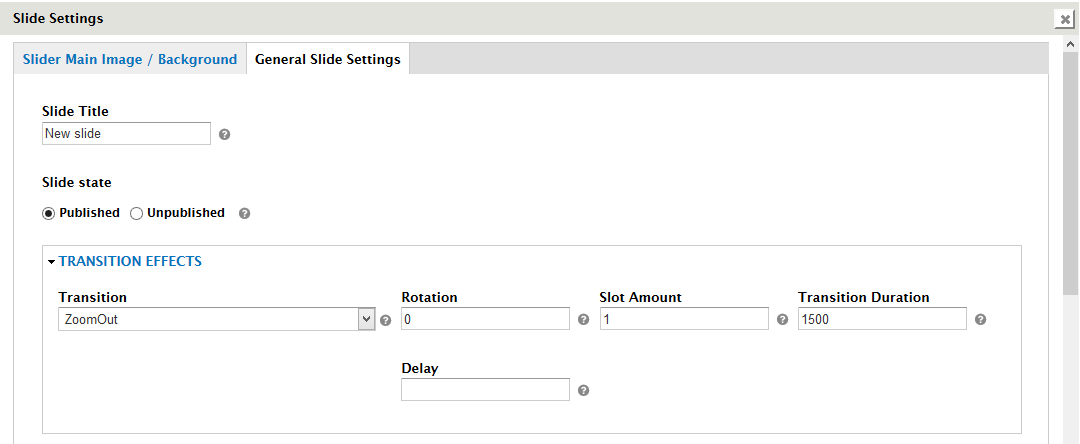
- Slide Title: The title of the slide, will be shown in the slides list.
- Slide state: The state of the slide. The unpublished slide will be excluded from the slider.
- Transition: The appearance transition of this slide.
- Rotation: Rotation (-720 -> 720, 999 = random) Only for Simple Transitions.
- Slot Amount: The number of slots or boxes the slide is divided into. If you use boxfade, over 7 slots can be juggy.
- Transition Duration: The speed of the transition in 'ms'.
- Delay: A new delay value for the Slide. If no delay defined per slide, the delay defined via Options (9000ms) will be used.
- Link: A link on the whole slide pic.
- Target: The target of the Link for the whole slide pic. (i.e. '_blank', '_self').
- Link to slide: If this value is set, click on slide will call the next / previous, or n th Slide.
- Title: In Navigation Style Preview1- preview4 mode you can show the Title of the Slides also. Due this option you can define for each slide its own Title.
- Thumbnail: In Navigation Style Preview1- preview4 mode you can show the Title of the Slides also. Due this option you can define for each slide its own Title
- Class: Adds a unique class to the li of the Slide like class='rev_special_class' (add only the classnames, seperated by space).
- ID: Adds a unique class to the li of the Slide like class='rev_special_class' (add only the classnames, seperated by space).
- Attribute: Adds a unique Attribute to the li of the Slide like attr='rev_special_attr' (add only the attribute)
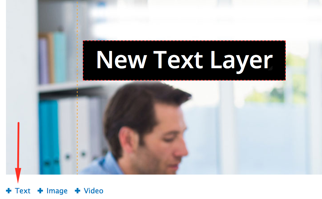
Slide Layer Content
Once you've setup your slide's main settings, you can add additional content to the slide such as Text/HTML, Images and Video. This section will cover how this can be accomplished.
Slide (visual preview + layer management)
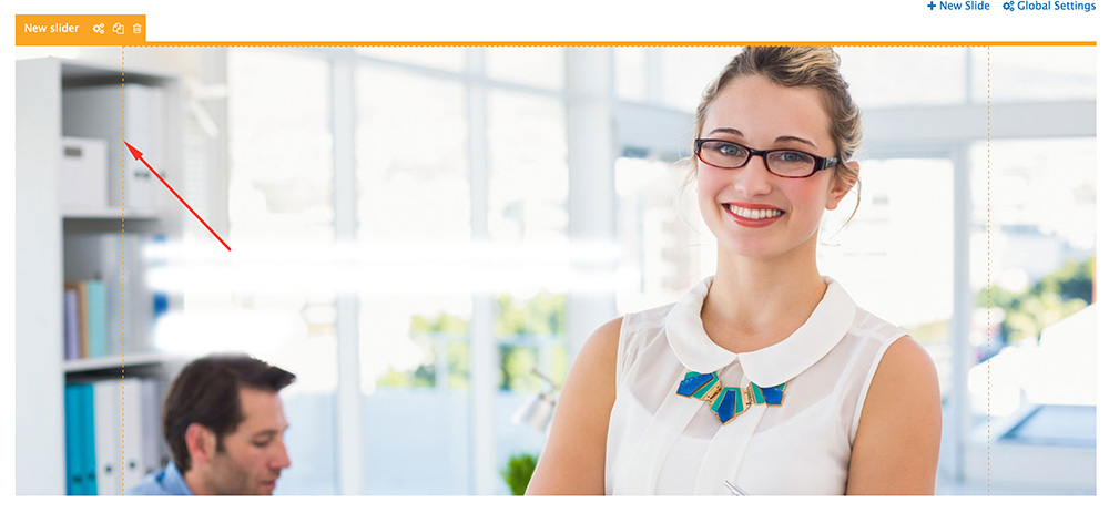
Dotted border represents the slider’s Grid Size. For proper responsiveness , all layers should be positioned within this box area. The edges outside the boxed area is a visual preview of how the image would look on a “Full Width” screen.

- 1. Slide Settings
- 2. Duplicate Slide
- 3. Delete Slide
- 4. Add Text Layer
- 5. Add Image Layer
- 6. Add Video Layer
- 7. Add New Slide
- 8. Global Settings
- 9. See Preview
Text/HTML Layer (including shortcodes and buttons)
^ back to Slide Layer Content menu
Special Note: Raw JavaScript/PHP should not be included here.
Basic Text
Raw HTML
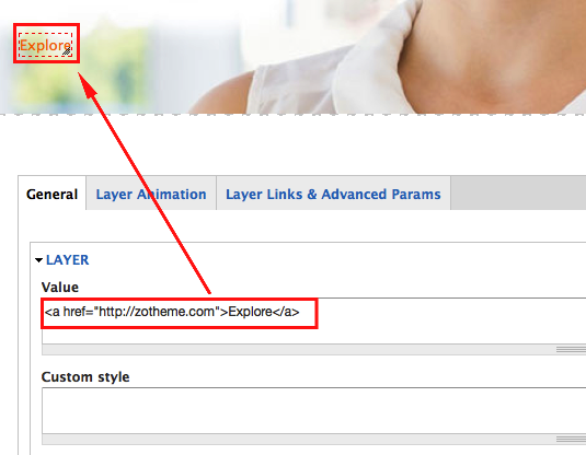
Image Layer
^ back to Slide Layer Content menu
HTML5 Video, YouTube & Vimeo
^ back to Slide Layer Content menu
The slider supports local HTML5 Video (video you upload to your own website), YouTube and Vimeo. For a good starting point, import one of the video demos.
HTML5 Video
To add an HTML5 Video, first upload the video to your website (sometimes this can be done from within the WordPress Media section, but often videos are too large and need to be uploaded via ftp).
Almost all browsers support "mp4" for HTML5 Video playback. The one exception is Firefox on Apple Macs, where an alternative video file is required. Alternative video formats are "ogv" (Theora) and "webm". If you have a video encoding program, there may be an option to create one of these formats. Otherwise, here's a free program you can use.
You'll only need one alternative video file for Firefox on Apple Macs (either "ogv" or "webm"). If you've added the video to the slider, and it isn't working, it's possible your server isn't setup to support these file types. Click here for more information about how you can add support for these file types to your website.
Special Note: Most mobile devices including iPhone/iPad do not allow autoplay for audio or video (they do this to try and save battery life). Because of this, use a "Poster Image" as the video's preview.
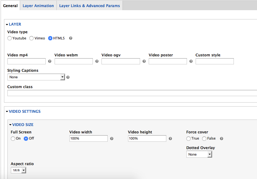
- Video mp4: The absolute url to the "mp4" version of the video (required).
- Video webm: The absolute url to the "webm" version of the video (see notes above).
- Video ogv: The absolute url to the "ogv" version of the video (see notes above).
- Full Width: Choose to display the video at "100%" width.
- Width: For accurate resizing enter the video's original width here.
- Height: For accurate resizing enter the video's original height here.
- Cover: Make the video cover the entire size of the slider (similar to the Background Fit -> Cover setting for a slide's main background image).
- Loop Video: Choose automatically restart the video when it ends.
- Autoplay: Start the video as soon as it appears inside the slider (not available for mobile devices, see notes above).
- Next Slide on End: Automatically navigate to the next slide when the video ends.
- Force Rewind: Force the video to rewind to the beginning if the user manually navigates to another slide.
- Hide Controls: Choose to hide the video players controls.
- Mute: Automatically set the video's volume to 0.
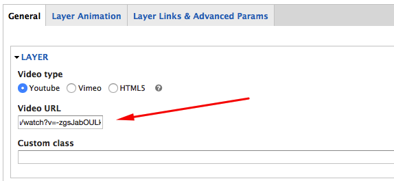
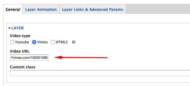
YouTube / Vimeo
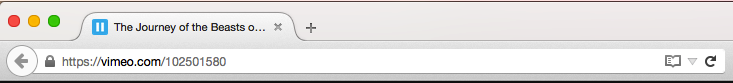
To add a YouTube or Vimeo video, visit the video on YouTube.com or Vimeo.com, and copy the video's url from the browser's address bar:
Special Note: If you have a Vimeo Pro account, and the Vimeo video is "private" and can't actually be loaded directly from Vimeo.com, from your Vimeo account, set the video to "public", then add the video, and then after saving the slider, go back to your Vimeo Pro account settings and set the video to "private" again.

Next, select either "Youtube" or "Vimeo", enter the video's url:
Special Note: YouTube and Vimeo videos will always "fit" the video to display within the allotted space. Because of this, if you need your video to always cover the entire size of the slide, use HTML5 video with the "Cover" option instead.
- Full Width: Choose to display the video at "100%" width.
- Width: For accurate resizing enter the video's original width here.
- Height: For accurate resizing enter the video's original height here.
- Loop Video: Choose automatically restart the video when it ends.
- Autoplay: Start the video as soon as it appears inside the slider (not available for mobile devices, see notes above).
- Next Slide on End: Automatically navigate to the next slide when the video ends.
- Force Rewind: Force the video to rewind to the beginning if the user manually navigates to another slide.
- Hide Controls: Choose to hide the video players controls.
- Mute: Automatically set the video's volume to 0.
- Preview Image: Add a custom preview image to be displayed instead of the YouTube/Vimeo default preview image.
- Arguments: Optional Youtube/Vimeo embed options.
click here for YouTube options, and click here for Vimeo options. Use the following format for custom arguments:param1=value¶m2=value
Slide Layer Settings
Once you've added a layer, the settings listed here will allow you to define the layer's position, style, hyperlink and animation.
Layer General Parameters
^ back to Slide Layer Settings menu
Layer Content Section: Apply and Layer Styles
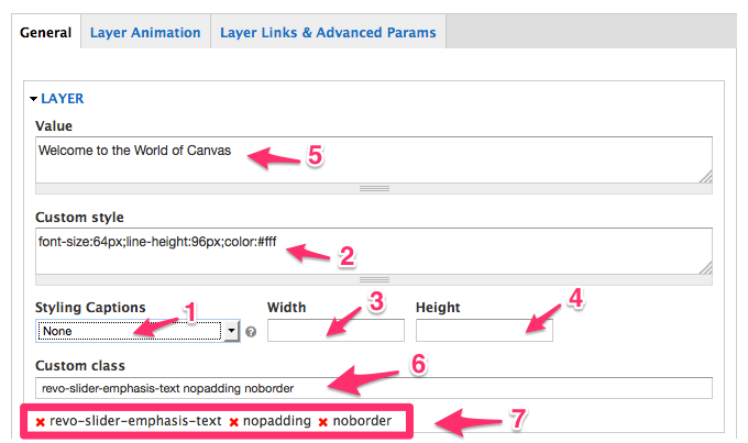
- Style: Choose a custom style from the drop-down list.
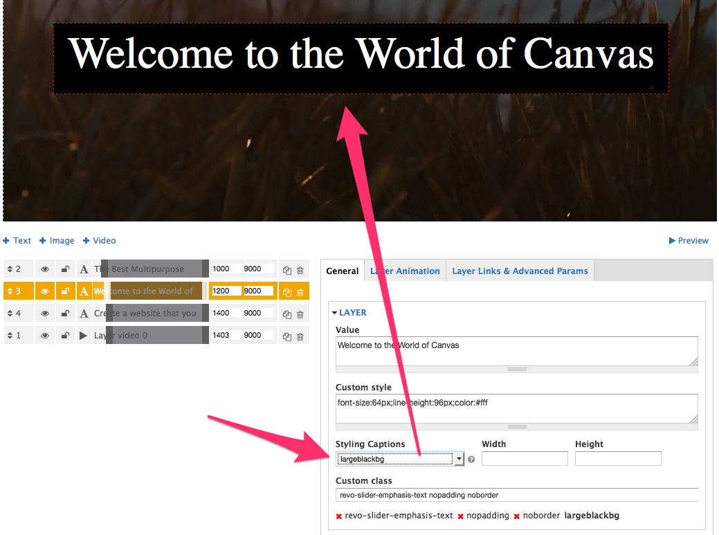
- Edit Style: Edit the layer's font-family, font-color, background-color and border.
- Layer width
- Layer height
- Layer Content Text or HTML for the layer (leave blank if the layer is an image or video).
- Custom class for this layer
- Remove Custom class
Align, Position & Styling: Position the layer within the current slider.
^ back to Layer General Parameters menu
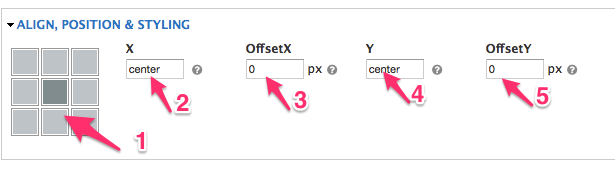
Special Note: All layers should always be positioned completely inside the preview grid. Although positioning content outside the Grid may be ok for larger screens, if the content isn't placed inside the preview grid, when the slider is resized down, the layers will often "bleed" outside the sliders view.
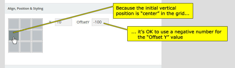
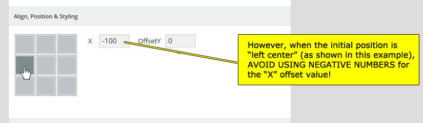
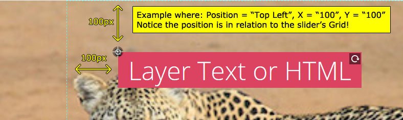
- Position: The starting position for the layer. The "X" and "Y" values will be in relation to this position.
- X: The horizontal spacing.
- Offset X: The horizontal spacing offset.
- Y: The vertical spacing.
- Offset Y: The vertical spacing offset.
Final Rotation: Apply a 2D rotation to the layer.
^ back to Layer General Parameters menu
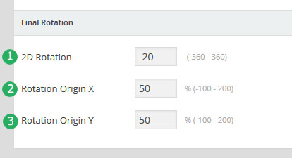
- 2D Rotation: The rotation value to be applied to the layer (enter "0" for no rotation).
- Rotation Origin X: The horizontal rotation axis point (usually "50%" is best).
- Rotation Origin Y: The vertical rotation axis point (usually "50%" is best).
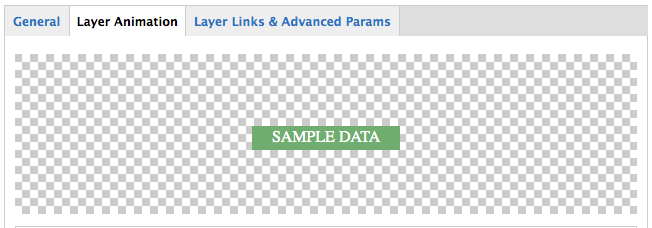
Layer Animation
^ back to Slide Layer Settings menu
Quick Tip: Want your layers to always animate out completely before the next slide loads? Check out the Save Performance option in the General Slide Settings section.
Preview Transition Section
Shows a live sample preview of the currently selected transition "Start" and "End" transitions.
Start Transition
^ back to Layer Animation menu
The transition for when the layer first appears.
Quick Tip: Want a "No Transition"? Select "Fade" for the "Start Transition", and enter the number "0" for the "Start Duration".
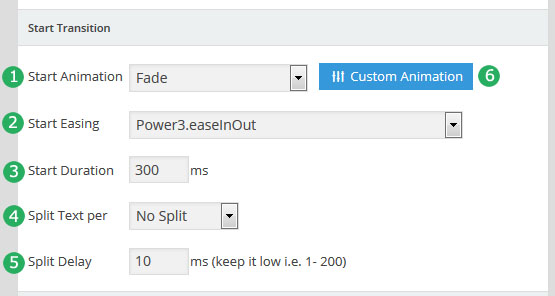
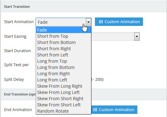
- Start Animation: The transition type for when the layer first animates into view. Default options:
- Start Easing: The algorithm used for the transition. Click here for a visualization of some of the different options (you can also select different options and preview the easing in the admin's "Preview Transition Section").
- Linear based transitions: No acceleration or deceleration.
- EaseOut based transitions: Transition will start out fast, and slow down toward the end.
- EaseIn based transitions: Transition will start out slow, and speed up toward the end.
- EaseInOut based transitions: Transition will start out slow, then speed up toward the middle, then slow down toward the end.
- Start Duration: The total time the transition should last (in milliseconds). Usually a number between 300 and 1000 is best.
- Split Text per: Applicable for text-based layers only. Choose to animate text's letters, word or lines sequentially. Import the "textsplits.zip" demo for a good example of Text Animations.
- No Split: Animate all the text at the same time.
- Char Based: Animate each letter individually (usually best when used for single lines of text).
- Word Based: Animate each word individually.
- Line Based: Animate each line individually.
- Split Delay: The time (in milliseconds) between each animation when one of the "Split Text" options is used. For example, if "Split Text per -> Char Based" is selected, and the number "10" is entered here, the letters will animate one after the other every 10 milliseconds. Usually "200" or below is best.
- Custom Animation: Create a new transition with custom options. Clicking this button brings up the following admin window:
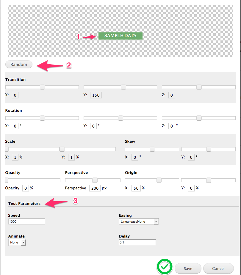
- Live Preview: Shows what the custom animation would look like in real-time.
- Randomize: Randomize the settings to create a totally unique transition or for some creative inspiration.
- Test Parameters: Adjust the animations speed, easing, etc. (these settings are for previewing purposes only. For example, if you adjust the "speed" and find a value you like, once the Custom Animation is created, you'll need to re-enter this value into the layer's official "Start Duration / End Duration" fields.
- Layer Animation Settings Panel:
After adjusting the custom settings, click the Save
End Transition
The transition type for when the layer animates out of view. The options here are identical to the Start Transition described above. The one exception is you can select "Choose Automatic" for the "End Animation", which will then apply the same settings defined in the "Start Animation" section (but in reverse order).
Loop Animation
^ back to Layer Animation menu
Animate the layer continuously after it appears on the screen.
Special Note: A "Loop Animation" won't show up in the "Layer Animation Live Preview" above. Instead, click the magnifying glass icon located toward the top-right corner of the screen for an official preview.
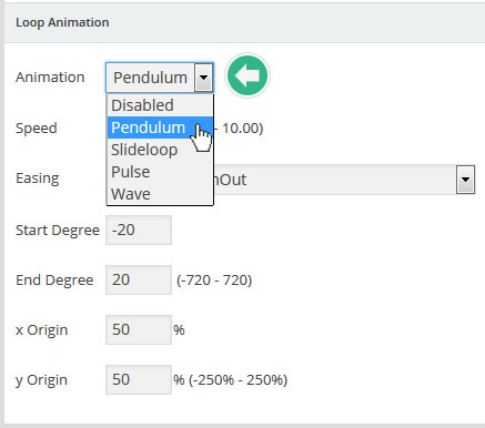
This featured is best explained by listing the life cycle of a layer animation:
- Start Animation: The animation that happens when the layer first appears.
- Loop Animation: The animation that continuously happens after the "Start Animation" completes.
- End Animation: The animation that happens when the layer animates out of view.
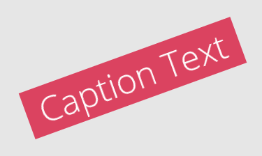
There are four options for the "Loop Animation". Click each image below to see an animated gif showing an example of what each option looks like:


Layer Links & Advanced Params
^ back to Slide Layer Settings menu
Important Note: The "Layer Links" section here is only for hyperlinking a layer to another slide (this is particularly useful for building custom navigation layers). Click here to learn how to hyperlink a layer to another webpage.
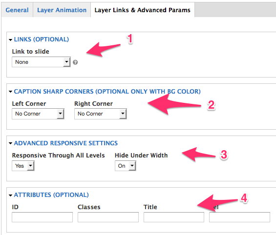
- Links (optional): Choose to link the layer to another slide within the current slider.
- Not Chosen: No link
- Next Slide: Link to the next slide
- Previous Slide: Link to the previous slide
- Scroll Below Slider: Clicking the layer will scroll the web page to a certain point beneath the slider.
- Specific Slide: Link to a specific slide in the current slider.
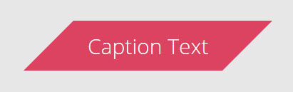
- Caption Sharp Corners (only available when a layer has a solid background color)
Sharp:
Sharp Reversed:
Combination - Left Corner = Sharp, Right Corner = Sharp Reversed:
Combination - Left Corner = Sharp Reversed, Right Corner = Sharp:
- Advanced Responsive Settings:
- Responsive Through All Levels: Only applicable to HTML-based layers that include multiple HTML elements. When selected, the slider will attempt to resize all HTML elements present inside the layer.
- Hide Under Width: Choose to hide the layer on mobile. A value for #2 or #3 in the Mobile Visibility section must be entered first.
- Attributes (optional): Include optional attributes for the <li> element that represents the current slide.


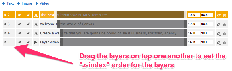
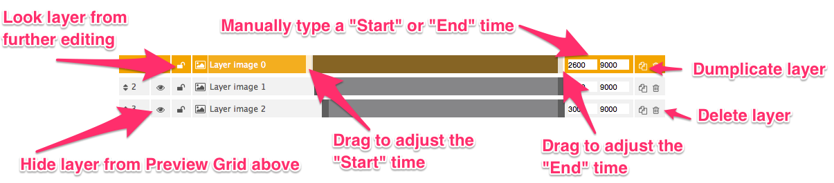
Layers Timing & Sorting
^ back to Slide Layer Settings menu
This section is where you can adjust the z-index of your layers (which layers appear on top of others in case they're supposed to overlap), and also where you can define the Start Time and End time of the layer's animation.
Special Note: The "layer timeline" shown in the screenshots below is a direct representation of the slide's delay value. And it's within this time frame that layer content can be animated into and out of view. So think of the number "0" as the very beginning of when the slide appears, and the slide's "delay" value as the very end of the layer timeline.
Set the z-index for each layer:
Adjust the "Start" and "End" time of the layer animation and Layer Options
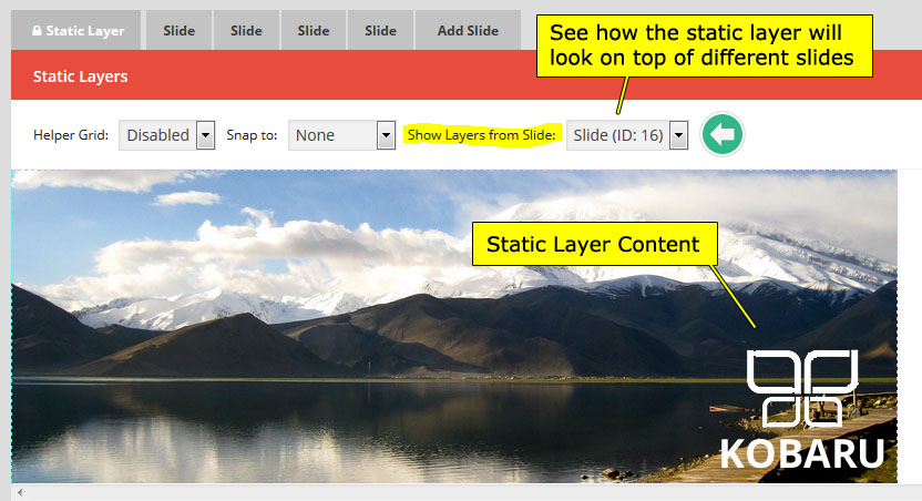
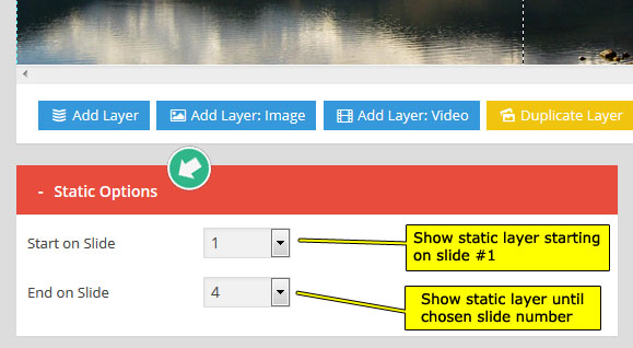
Static Layers
Static Layers are useful for when you have content that you'd like to appear at all times. For example, maybe you have a slider with 5 slides, but want to show your logo on top of the slider no matter what individual slide is present. In an example like this, you could add your logo as a "Static Layer".
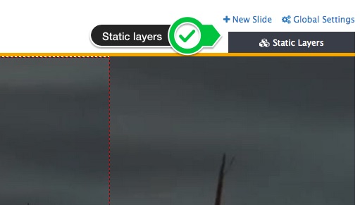
The "Static Layer" options are almost identical to setting up layers for a regular slide covered HERE and HERE. But there are a few special options that apply to Static Layers only shown below:
Google Fonts and Custom CSS
Inside the Global Settings popup, you'll see a menu tab named Custom fonts/CSS.
You can add google fonts to use in slider, mutiple fonts is sparator by "|". Example:
http://fonts.googleapis.com/css?family=Open+Sans:300,400,600,700,800|http://fonts.googleapis.com/css?family=Raleway:100,200,300,700,800,900
You all can add custom css for in Custom CSS textarea
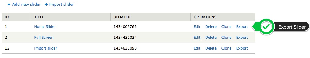
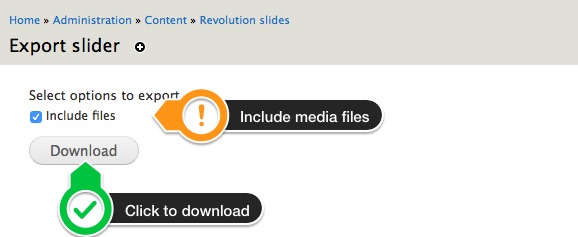
Export Sliders
Export for WordPress Usage
Sliders can be exported and then imported. This is useful for creating a backup of the slider, and also for transferring a slider from one domain to another. To export a slider, visit your sliders list, and click the "Export Slider" button. This will create a zip file of your slider, that can be saved on your computer for importing at a later time.
Troubleshooting
If you've created a Slider and added it to one of your pages, but it isn't showing up, here's a list of things you check:
- Try a different method of adding the Slider to your page.
- Visit the slider's Troubleshooting settings and adjust the options to see if an adjustment fixes the issue.
- Try choosing "By Compressing Output" or "By Echo Output" for the Output Filter Protection option in the Global Settings.
- Update to the latest version of WordPress.
- See if there's a conflict involved with another plugin or your theme. Temporarily switch to another theme and disable your other plugins one by one and test the page throughout the process.
- View your page's HTML source to see if the page is loading in more than one copy of jQuery's main script (a page should always only load one copy of jQuery). Usually when a page is loading two copies of jQuery, it's because the theme is loading in a custom copy of jQuery as opposed to the default jQuery that normally comes packaged with WordPress.
Troubleshooting FAQ's - (click here for all FAQ's)
- Troubleshooting 101
- "The package could not be installed. No valid plugins were found"
- Revolution Slider Error: Slider with alias not found
- Images not Loading on Front-End
- Slider not working after migrating site to new domain
- Changes on CSS Documents has no Effects on front-end
- Trouble with applying a preset style to a text layer
- Slider not Visible on front-end
- Slider not working when placed inside Tabs widget
- My main menu's submenu is hidden behind the slider
- Video Size and or Positioning is Wrong
- Purchase Activation Section is Missing
- HTML5 Video Playback in one browser does not work
- Remove unwanted left margin/padding from slider